by Naples Print Source | April 22, 2023 | Marketing, Printing Techniques:
Have you had an idea for a marketing piece that just didn’t seem to come together the way you had hoped? Were you stumped about how to design it in a way that it could be produced? And, were you under a tight deadline to make it happen?
When Butcher Private came to us looking for help with an unusually large pocket in a presentation folder, and seeking a relatively quick solution for a piece that would appeal to a high end audence, we were relentless in our efforts to develop a solution, including a prototype and then a final product.

To market their new exclusive dining concept, Butcher Private wanted to invest in a premium folder that would be attractive to their wealthy target audience and engage them in a way that they would be inspired to open the piece to learn more.
Through prototyping, we were able to develop a concept piece that they could test and use in the short term while we collaborated with them on the final options.
Protyping is a marvelous iterative process that gives us the opportunity to explore—with our client—what can and cannot be done to achieve their vision for the marketing piece. Through the process, we run into the “we can’t do this, but we can do that” moments that can quickly move the collaborative team from feelings of frustration and disappointment to surprise and delight. We wouldn’t know the options and possibilities without the consultative creative process.
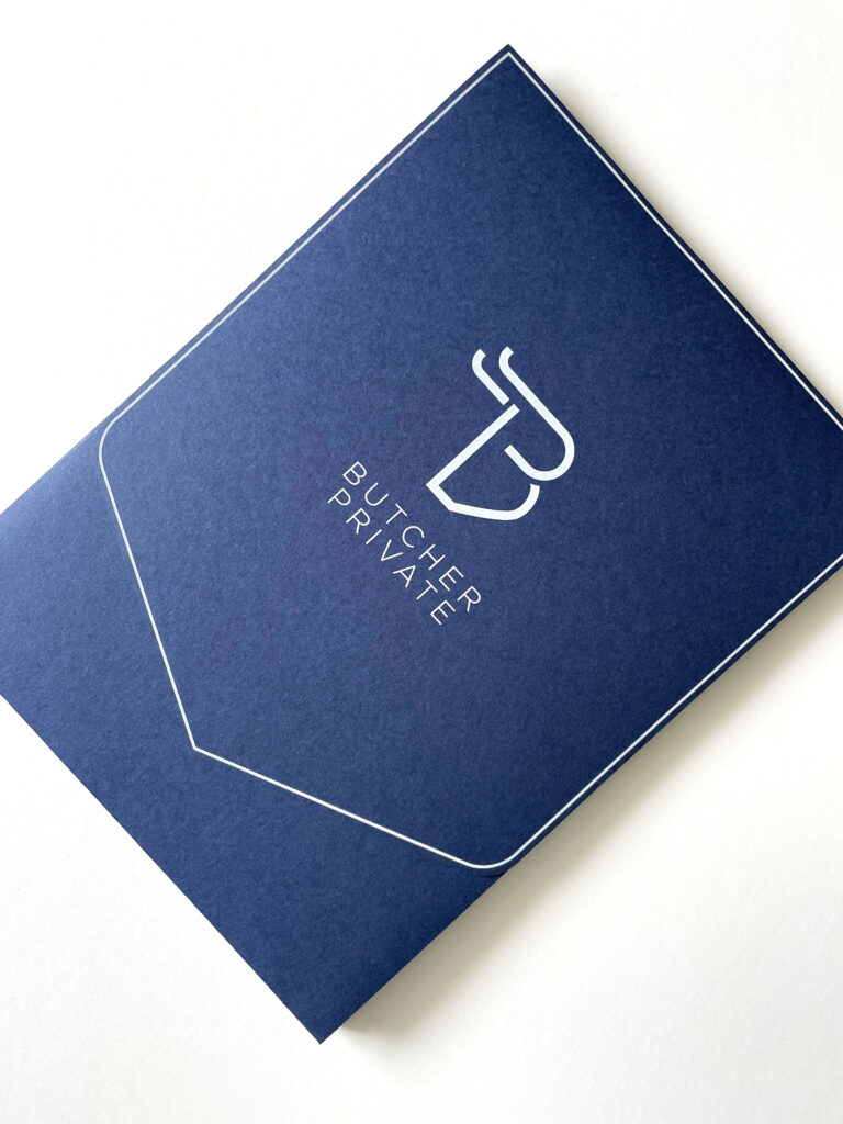
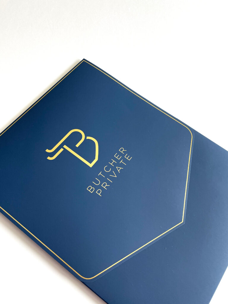
One of the significant challenges for the presentation folder project was the sheer volume of membership materials to be included in the pocket. I am especially pleased with how the glued gusset pocket design provides a practical solution for 32 sheets of branded materials. For this project, prototyping provided the client with temporary presentation folders, utilizing standard blue paper and white ink printing, while we produced the final version. Here you can see a video of both the prototype folder along with the final version of the elegant presentation folder using the premium Touche paper with gold foil stamping.
The original prototype, with the soft touch lamination and white ink, and the final version, with the premium Touche paper and golf foil stamp, look and feel quite similar. Some may not even not see the difference, so it worked well as a temporary solution. Here you can see the final version with the integrated business card feature. This special feature, by the way, exceeded our expectations. We struggled with how to fit it in using the standard sized premium Touche paper to construct the gusset pocket and cover flap, without having the card show below the front tab. The solution was to situate the business card die cuts farther up on the gusset pocket, forcing the business card to sit a bit higher, achieving an even classier, more artistic presentation.

As many of our clients know, we are especially good at dealing with the “That’s not going to work” moments and turning them into a finished project that meets the specific need and makes everyone involved proud of the final solution.
If you are in the middle of—or just starting—an unusual or complicated project for a high-end audience, Schedule a Consultation or Contact Us today. If you’d like to see more examples of our work, please check out our Instagram page.
